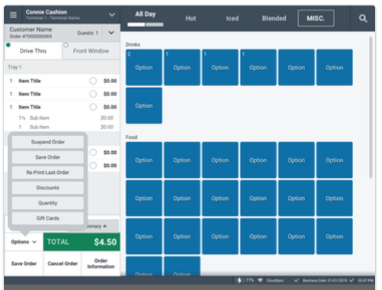
Xenial POS is a portable, cloud-based POS that can be installed on an iPad and used anywhere. One of our clients primarily uses it outside, which created unique user issues.
The Problem
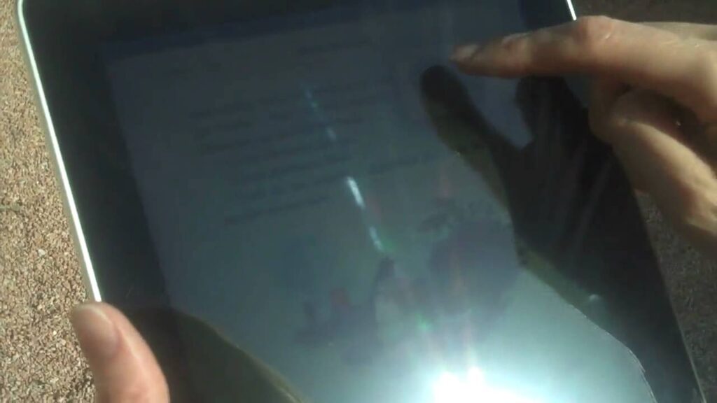
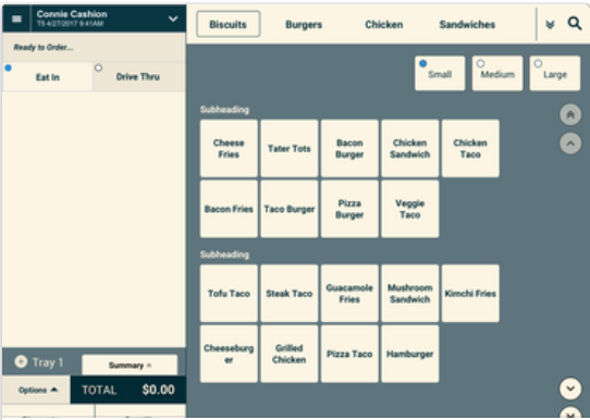
When the Xenial POS was in testing and discovery, it was always used in an indoor environment.
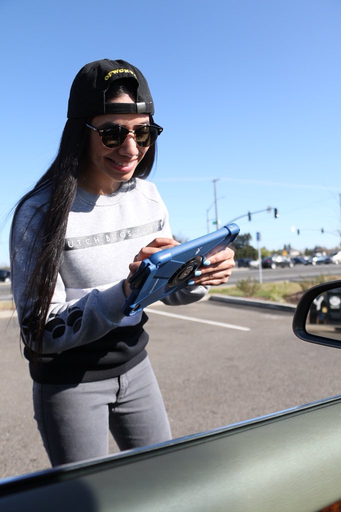
When users started frequently using it outdoors in direct sunlight, the problem emerged. IPad tablets have a highly reflective surface so the screen becomes very difficult to see. It is imperative that our POS is designed for user speed. Lack of visibility could impact speed, which is a concern.
Problem Statement:How might we improve direct sunlight visibility and eliminate any negative impact to cashier speed?
The Research
Research TechniquesInformation gathering through investigation of existing knowledge in the space and user testing.
Peer Articles on Glare and Tablets
We read about best practices for glare.
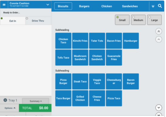
We discovered ideas for glare reducing solarized themes.
User Testing Methods
We tested with 6 people in direct sunlight
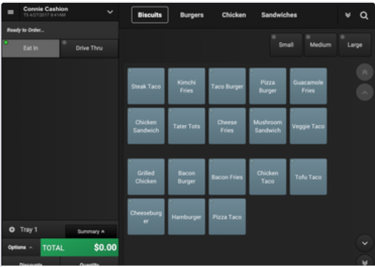
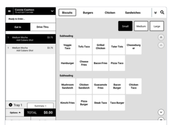
We timed them “pressing” buttons on each of the color schemes we prepared
Each theme had the same products in randomized locations.
We timed each user and asked which they found the easiest, most difficult.
Results
The Dark theme was the most difficult and was perceived as the most difficult.
We found many participants had various forms of color blindness.
The solarized was optimized according to peer research but it did not test well.