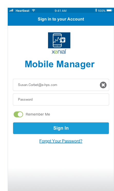
Xenial Mobile Manager (XMM) is a SAAS Product that is a data reporting tool to help employees in management make informed decisions and stay ahead of negative outcomes.
We will examine some challenges this existing product was facing and ways user research gave insights to produce better outcomes for our users and customers.
The Problem
We received many user complaints about this product, which was expected. This product was cobbled together from the remnants of another product with little thought to user needs.
As a result, many users gave negative feedback or flat out refused to use it. This is not an acceptable outcome.
Problem Statement:How might we diminish the negative user feedback this app is receiving and increase usage?
The Feedback
I just want to see my sales by hour for my stores!
I waited 5 minutes for a page to load. Are you serious?
I get an alert for Store #11234. I don’t know what that is?
I tried to log in last week and it kept crashing. I gave up.
The Research
Research TechniquesInformation gathering and classification through user interviews and competitor research.
User Interviews
Single Site Managers
Multiple Site Managers and Franchise owners
These clients were being moved from competitor products to our product, so it was important to capture missed mental models, user flow from competitor products and lessons that could be learned.
"I don't know where to find the information I need"
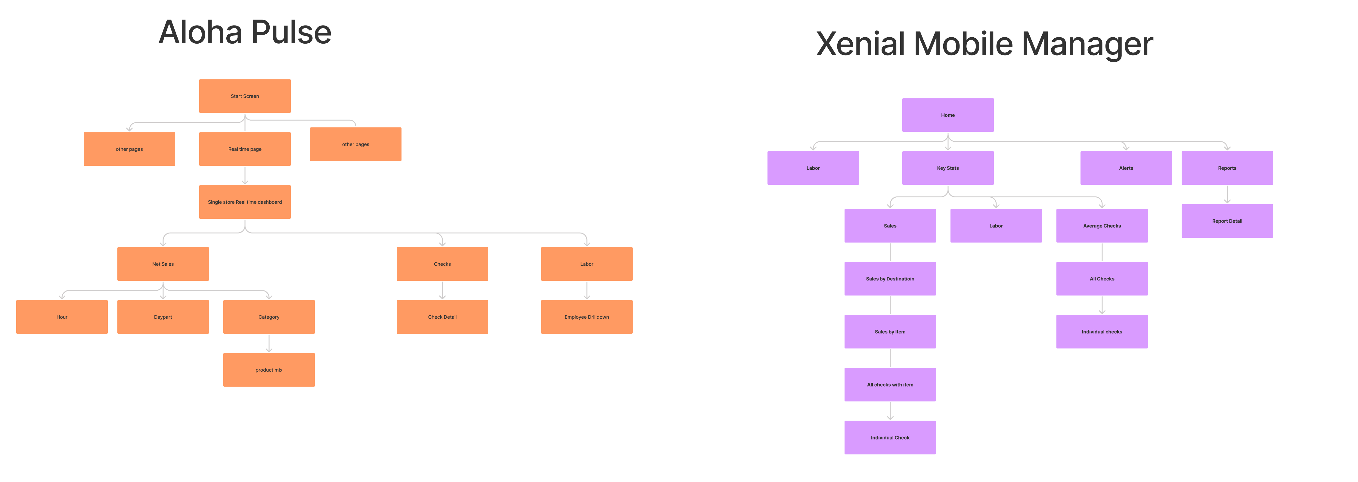
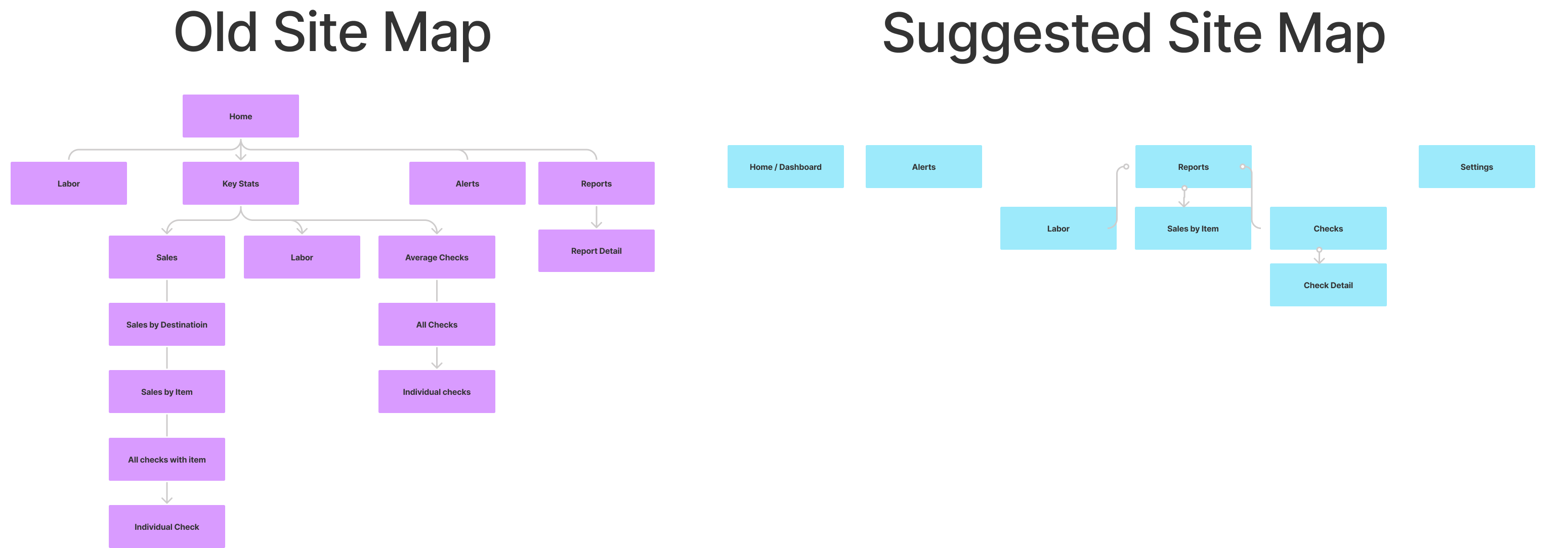
Comparative Site Map
We examined the navigation patterns of competitor products
Even though the competition is more complex, the XMM sitemap still has more complexity.
We discovered that XMM’s navigation could be planned for easier navigation
Simplify and flatten
Don’t bury pertinent information
Comparative Site Map
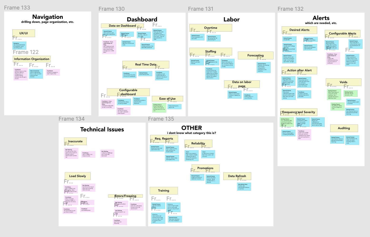
affinity map image
Affinity Mapping
organizing interview feedback into patterns
We grouped negative feedback into red cards, neutral feedback into blue cards and positive feedback into green cards.
We must pay as much attention to what works as what doesn’t work
We discovered many technical issues with loading times.
Users said the app crashed, but in honestly it was probably loading and communicating status poorly
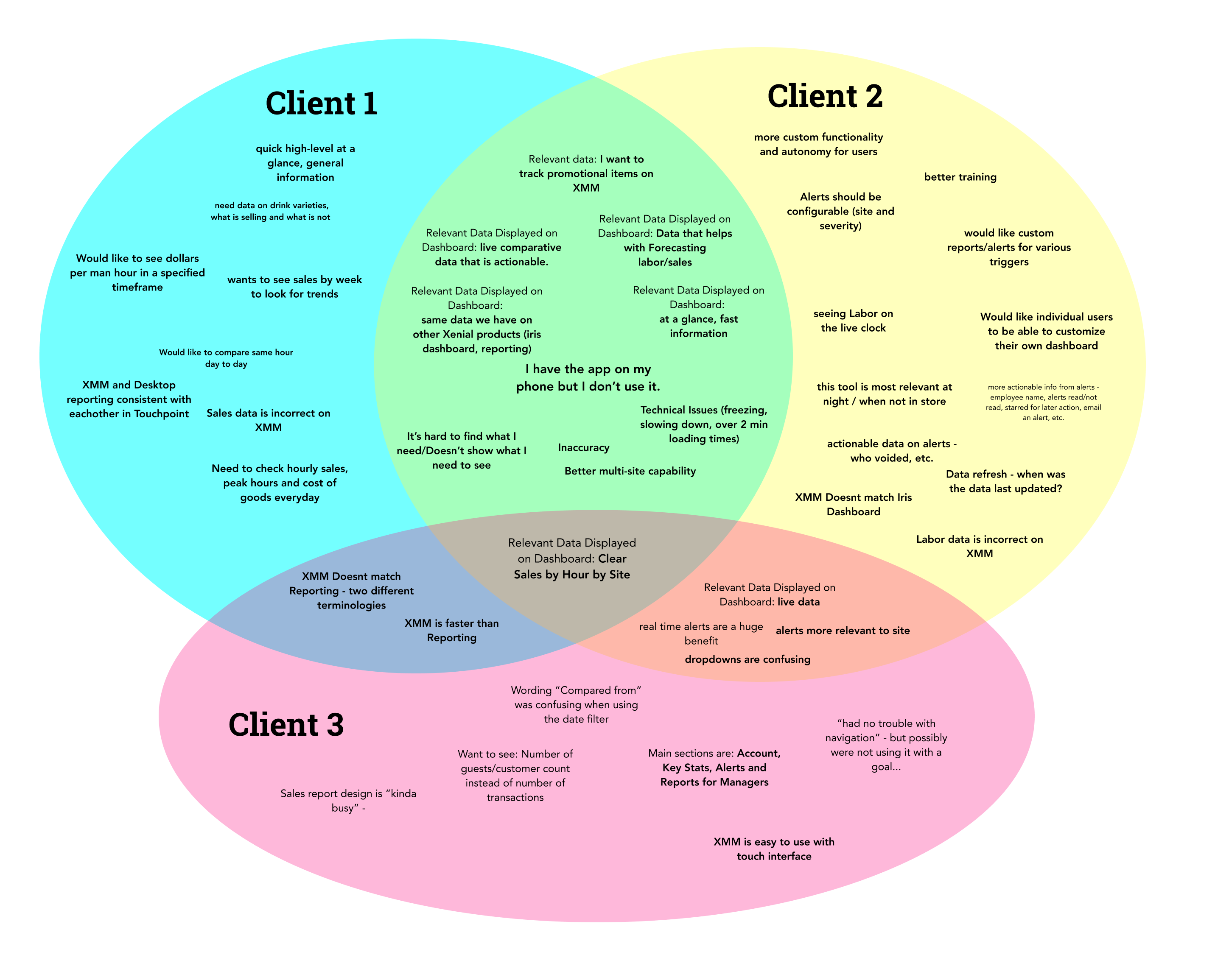
Venn Diagram of Client Issues
Organizing interview feedback into patterns by client use case
Pinpointing Cross Client Issues
Noticing outlier issues that may only apply to certain clients and user types
This can be a method for prioritizing by shared issue
This can also be a method for prioritizing by largest client base (Pareto Principle)
The Analysis
Technical issues
Frequent crashes created a feeling of unreliability
Long loading times create frustration and cause people to give up on the app, when it was actually still loading
When system status isn’t communicated, users assume an error has happened and say “it doesn’t work”. Perceived malfunction and actual malfunction matter
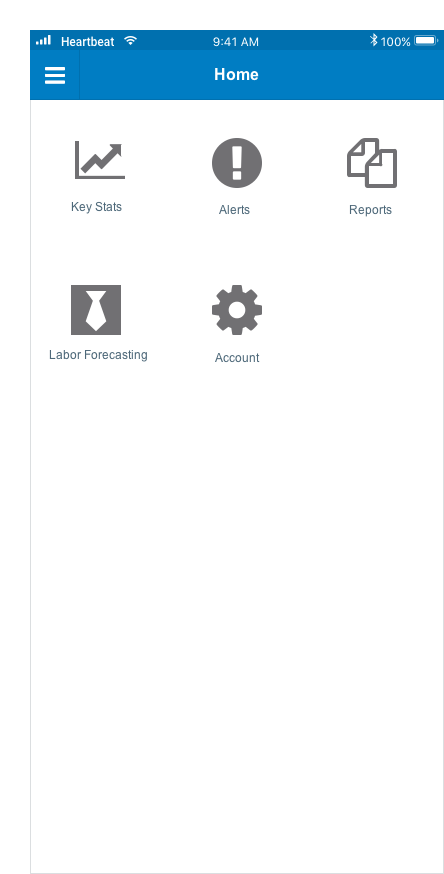
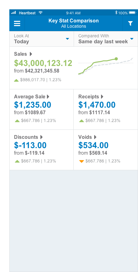
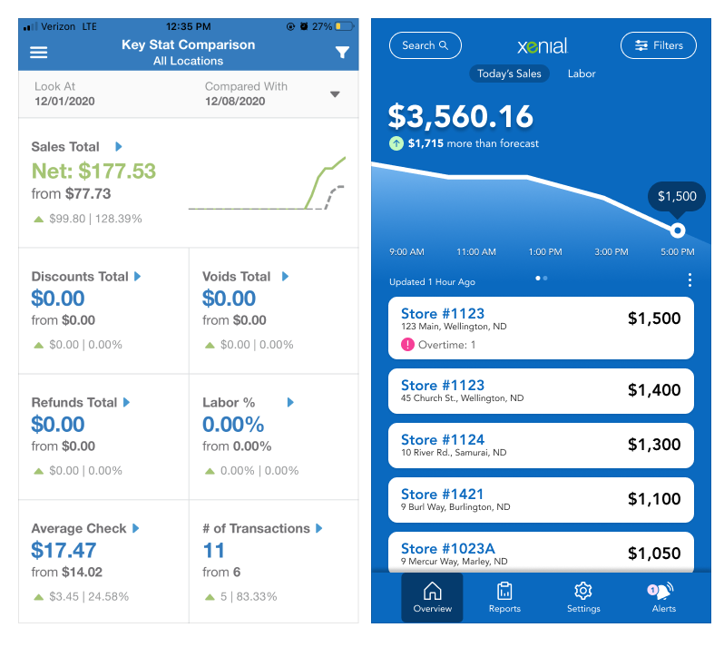
The dashboard
Where do I find my Hourly Sales?
I want to see the sales for my stores at the top level
Home screen should look and feel like a dashboard
Dashboard should reflect key metrics
System should communicate the last time it was updated
The Solutions
Poor Information Scent + Confusing Navigation
To address navigation issues, we begin with flat navigation – starting at a dashboard home screen.
We expose the user to 80% of information upfront, nothing hidden.
Unnecessary drill downs and bits of informations have been omitted. This is an at-a-glance reporting tool, so we should prioritize short sessions and learn more about deep dives before investing the work there.
The new site map is flatter and includes less information.
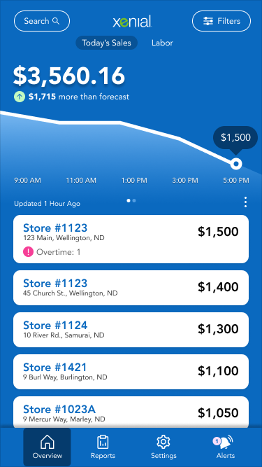
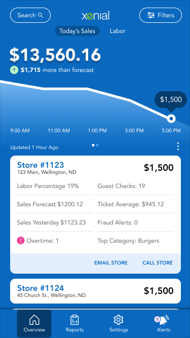
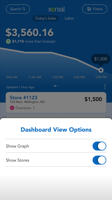
Meaningful Dashboard
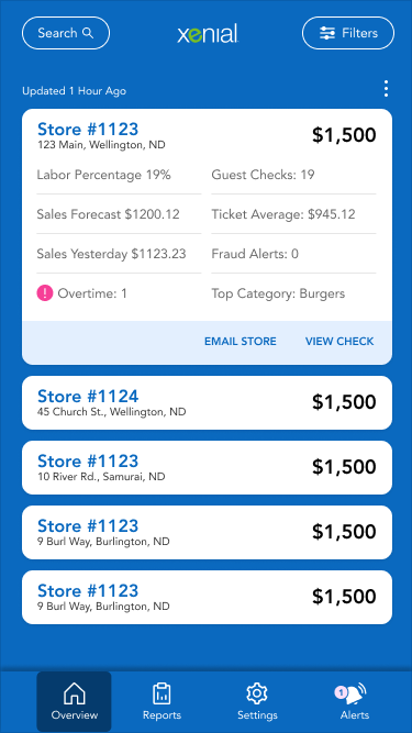
We bring sales by hour front and center, so employees can immediately see this important metric
We also allow seeing more information on stores, by tapping on the collapsed tile to expand, and then tapping on the store stat to see more information.
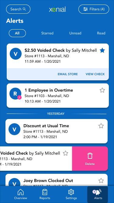
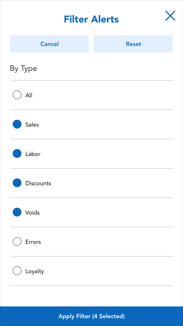
Clear notification of alerts
All navigation is brought to the main screen and not hidden
Search is added to help with information architecture
Time of update has been added
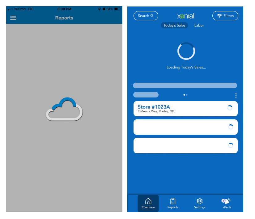
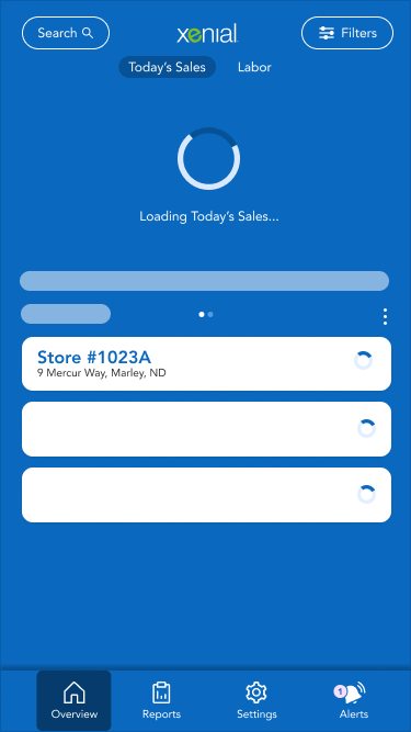
Easier Dashboard
Slow Loading
Perceived speed vs actual speed
Since speed exists as a relative concept in the user’s perception, we can manipulate
By using a skeleton load, we can occupy the user’s attention and decrease perceived load time without addressing the technical issues.
We can also progressively load the page to relieve pain from slow loading times.
We can alternatively bring in a progress bar instead of a spinner.