To show my work, I’ve decided to take you through some of the tools I use to create interfaces. I’ve done user testing, created a mobile lab, run a UX centered meet-up group, write articles and I’ve conducted countless workshops and exercises. If you want to know more, please talk to me!
Interface Design
Why I used it: A major part of user experience is providing aesthetically enthralling interfaces to engage. Our work culminates in an artful interface that is easy to use. Skilled designers must be familiar with UI patterns that are most effective with users and give work a modern, innovative, artful experience.
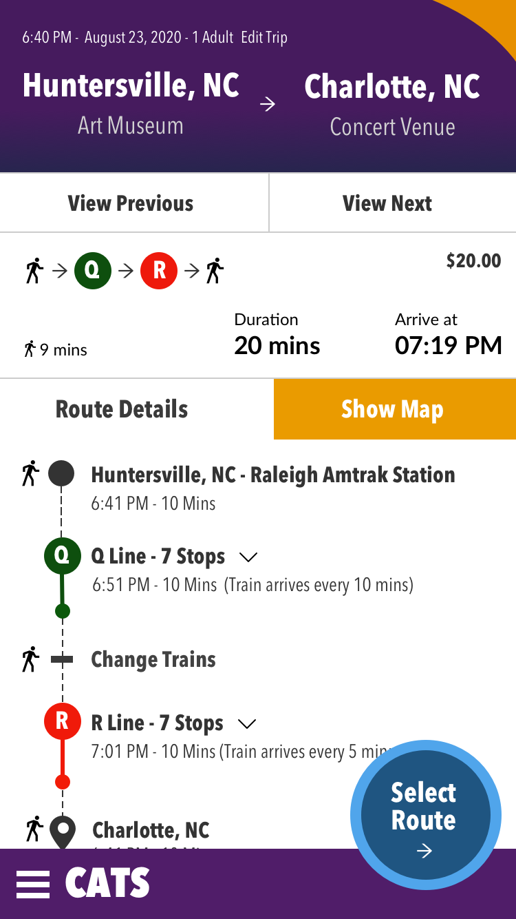
This project: In my day to day work, there aren’t many opportunities for creative design. This particular project is a result of one of the many classes I’ve attended. Note on the title screen, instead of using a dropdown the UI allows the mobile user to directly select the option they require. Everything is immediately shown to the user, with quick use as the goal. The action button is placed for easy thumb access. On the next screen, we let users sort information in a way that is meaningful to them. The information is so clear that a person who can not read the language could understand.
Rail Mobile App Example: This app designed using no drop-downs on the home screen.
Personas
Why I used them: Personas are simply a tool to help us understand our users. Before we can create positive impact for our users, we must have some means of understanding them and helping others to understand them.
How they helped: By reviewing personas with various members of the team, it helps them to visualize the differences between their own viewpoint and the user’s viewpoint. It helps bring conversations about user needs and pain points to the forefront. When people bring inaccurate assumptions about our users to the table, it empowers non-UX team members to correct those biases
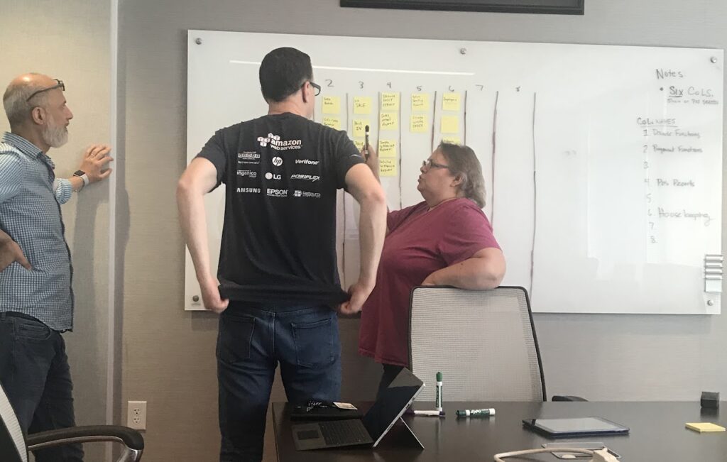
Affinity Mapping
Why I used it: We collected a great deal of information that we needed to organize. We decided to use affinity mapping and it has been our go-to information sorting tool since. We put the information onto post-its or virtual post-its and then instruct participants to separate the information into categories. We conduct these exercises with stakeholders, developers and the UX team. The stakeholders and developers only participate for about 30-60 minutes, and the UX team takes it home.
How it helped: By involving stakeholders and developers in this sorting, they gain exposure to user centered information in a goal-oriented way. They have to read it and process it. Whereas you could simply say in a meeting, “90% of our users gave this same feedback,” it’s more impactful when those participants spend 15 minutes sorting 30 post-it notes about the same topic over and over. This is also helpful in that it gives us a historic topical repository of user feedback at the end.
Information architecture: Card Sorting
Why I used it: In creating a quality information architecture, one of the foundational elements is the schema, how the information is sorted and organized. We needed to create a schema for our Functions menu, so we decided to use a card sort with experienced users to gain insight.
How it helped: The set up of the exercise took about 30 minutes, making cards for all of the topics, arranging invites and attendance and setting up the white board. The exercise itself was completed in less than 30 mins. If we had a room full of stakeholders arguing about the schema, it would have taken much longer. By letting our users work, we were able to reach a reasonable conclusion in a fraction of the time.
Data Visualization
Why I used it: The heart of any tech company is data. The better we can understand data or help users understand data, the more successful we will be in reaching desired outcomes and goals. In order to be effective, the ability to visualize data clearly is integral for any UX professional.
How it helped: Data Visualization is just like any other aspect of design – it’s a tool to communicate ideas. By creating clear, organized data with insights and clear directives to users we can help them understand their goals and gauge their progress in achieving mastery.
User Testing with Prototypes
Why I used it: User testing with prototypes is one of the backbones of UX work. You create a basic or robust prototype, run it by users and gain insights. It’s always profoundly enlightening. I have led testing sessions using paper, screen, touch and voice prototypes.
How it helped: In one instance, I conduced a prototype testing session wherein it became clear multiple participants were unable to see 60% of the screen. This large area of the screen seemed obvious to those taking part in the design, due to the sheer amount of the screen it covered. However, users helped us to understand the lack of contrast and lack of information hierarchy made that huge panel seem non-important and basically invisible to multiple users. If we hadn’t tested, we would have never uncovered that insight.
Accessibility Compliance
Why I used it: The internet is a utility for all people. It is a UX professional’s responsibility to be educated on the needs of users to make sure our software is enabling instead of disabling. When people are enabled to use our software.
How it helped: The more accessible a system is, the more users it can support. In addition, legislation and compliance requires accessible design in many cases.
User Interviews
Why I used it: In this particular case, our users had been through many changes with the pandemic. In addition, I’ve created a system in our User Research where we annually check in with a large number of users. This is a pointed audit with System Usability Scale (SUS) Quantitative grading.
How it helped: We were able to touch base with many users, get tons of feedback from them and evangelize their experiences. We sparked a ton of excitement in our company for the user responses. In addition, by rewarding the product that received the highest SUS score, we created a spirit of competition between product managers to provide the best user experience. With competitions like that, the users win!
Storymaps
Why I used it: The storymap is used to help pin down the features and requirements of an epic in a form that is visually easier to understand. This helps in creating flows and in aligning team thought. Thoughts and plans must be organized to be impactful.
How it helped: When it becomes time to do rapid prototyping, the storymap acts as a skeleton for flows we can create and test. Also, the storymap is helpful in sorting features to include in MVP and what may need to be pushed to a later version.
Storymap for new media management feature
Design Systems – Library Building
Libraries are the heart of design systems. I’ve built libraries in Sketch and Figma.
HTML – CSS – JavaScript Coding
The backbone of great UI work is coding. I’ve spent years of my past coding out interfaces. I can design a UI element and code it out, if needed.